October 5, 2021
Audio Data Analysis using Python

DURATION
15mincategories
Tags
share
Before we discuss audio data analysis, it is important to learn some physics-based concepts of audio and sound, like its definition, and parameters such as amplitude, wavelength, frequency, time-period, phase intensity, etc. Here are some concepts and mathematical equations.
Definition of audio (sound):
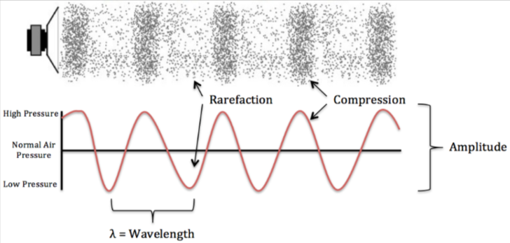
Sound is a form of energy that is produced by vibrations of an object, like a change in the air pressure, due to which a sound is produced. This change in pressure causes air molecules to oscillate.
Mechanical wave:
Oscillates the travel through space;
Energy is required from one point to another point;
Medium is required.
When we get sound data which is produced by any source, our brain processes this data and gathers some information. The sound data can be a properly structured format and our brain can understand the pattern of each word corresponding to it, and make or encode the textual understandable data into waveform. From that wave, numerical data is gathered in the form of frequency.
Our sound data in various form:
Wav (waveform audio file) format
MP3 (MPEG-1 audio layer-3) format
WMA (window media audio) format.
Below is the corresponding waveform we get from a sound data plot.
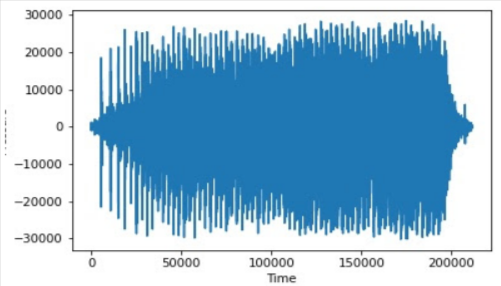
This above waveform carries
Frequency
Intensity
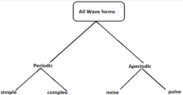
Now we see how our sound wave is represented in the mathematical way.
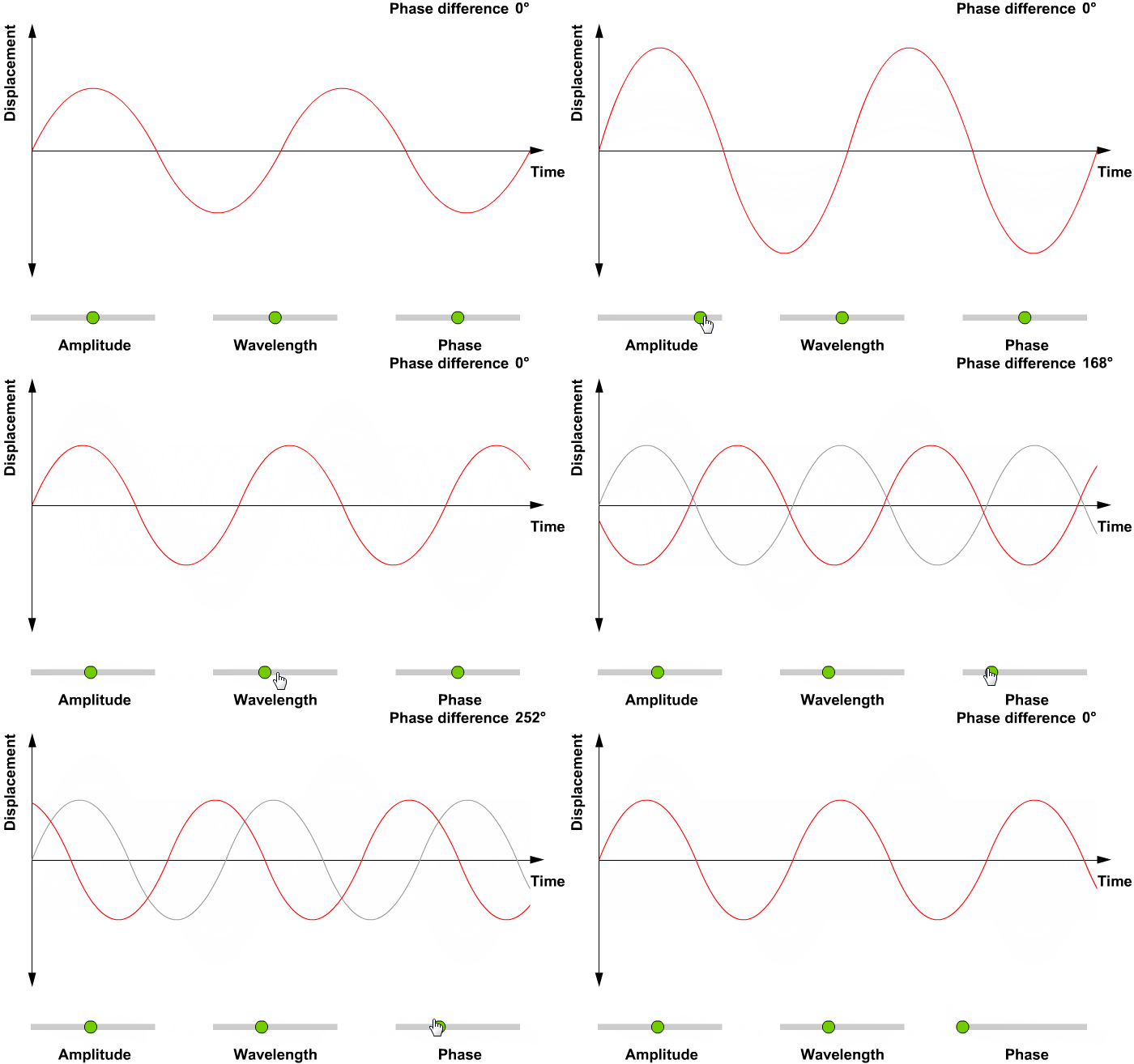
Y(t)=Asin(2πft+Q)
Amplitude:
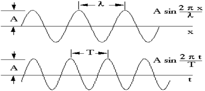
Amplitude is defined as distance from max and min distance.
In the above equation amplitude is represented as A.
Wavelength:
Wavelength is defined as the total distance covered by a particle in one time period.
Phase:
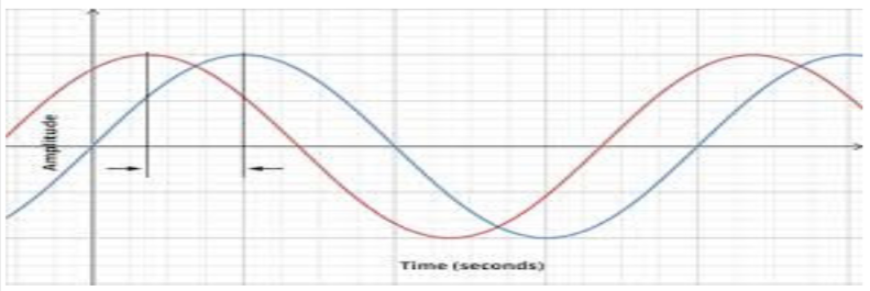
Phase is defined as the location of the wave from an equilibrium point as time t=0.
Now we will look at some important terms like intensity, loudness, and timbre.
power=2*pie*F/T
Rate at which energy is transferred
Energy is emitted by a sound source in all the directions in unit time
It is measure in watt/m^2
This is also called sound intensity or loudness.
Intensity is measured by various scales.
Logarithmic Scale
Decibels
Ratio between two intensity values
Use a frequency of reference
db(T)=10*log10(I1/I2)
Where I1 and I2 are two intensity levels.
Timbre:
Timbre describes the quality of sound. Like we see in a heatmap, there are different colors for different magnitudes of values. If we have different-different sounds in one file then timbre will easily analyze all the sound on a graphical plot on the basis of the library.
Timbre is multidimensional
Sound envelope
Harmonic content
Amplitude, frequency, modulation
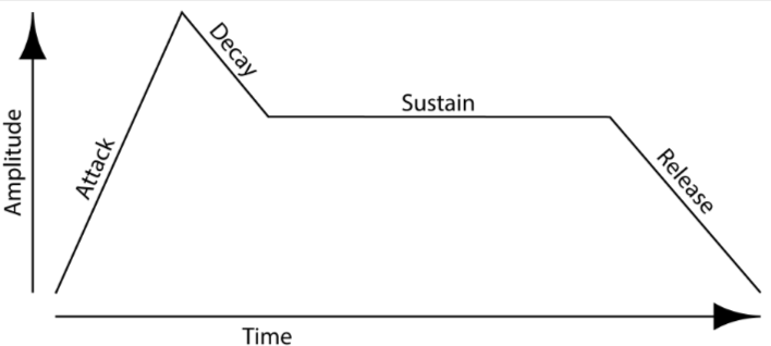
Attack-decay-sustain-release model; below is a graphical analysis.
The above data is in the form of analog signals; these are mechanical signals so we have to convert these mechanical signals into digital signals, which we did in image processing using data sampling and quantization.
There are a lot of techniques for data analysis, like statistical and graphical. Here we see the graphical way of performing data analysis.
Spectrogram
Using a spectrogram we represent the noise or sound intensity of audio data with respect to frequency and time. On the premise of those frequency values we assign a color range, with lower values as a brighter color and high frequency values as a darker color. A spectrogram may be a sort of heatmap.
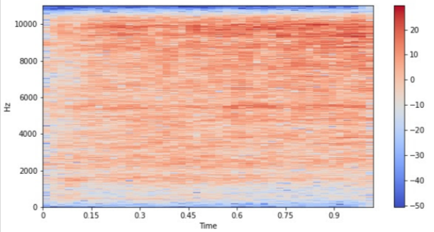
Below is code for a a spectrogram.
1
2
3
4
5
6
7
8
import librosa
audio = 'training\\00003.wav'
x, sr = librosa.load(audio)
X = librosa.stft(x)
Xdb = librosa.amplitude_to_db(abs(X))
plt.figure(figsize = (10, 5))
librosa.display.specshow(Xdb, sr = sr, x_axis = 'time', y_axis = 'hz')
plt.colorbar()
Feature extractions:
All sound data has features like loudness, intensity, amplitude phase, and angular velocity. But, we will extract only useful or relevant information. Feature extraction is extracting features to use them for analysis.
There are a lot of libraries in python for working on audio data analysis like:
Librosa
Ipython.display.Audio
Spacy, etc.
Centroid of wave:
During any sound emission we may see our complete sound/audio data focused on a particular point or mean. This is called the centroid of the wave. In other words, the center mass of audio data.
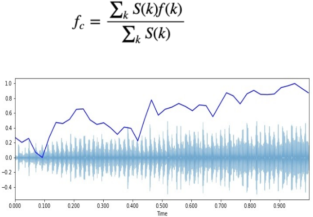
Below is the code of the program.
1
2
3
4
5
6
7
8
9
10
11
12
13
14
15
import sklearn
spectral_centroids = librosa.feature.spectral_centroid(x, sr = sr)[0]
spectral_centroids.shape(775, )
# Computing the time variable
for visualization
plt.figure(figsize = (12, 4))
frames = range(len(spectral_centroids))
t = librosa.frames_to_time(frames)
# Normalising the spectral centroid
for visualisation
def normalize(x, axis = 0):
  return sklearn.preprocessing.minmax_scale(x, axis = axis)
#Plotting the Spectral Centroid along the waveform
librosa.display.waveplot(x, sr = sr, alpha = 0.4)
plt.plot(t, normalize(spectral_centroids), color = 'b')
Spectral Rolloff:
In this method we try to analyze the waveform in which our frequency drops suddenly from high to 0. In the language of calculus we can say that there is a non-differentiability point in our waveform.
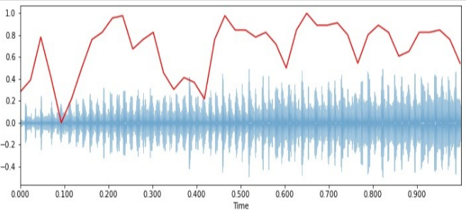
Below is the code of the function.
1
2
3
4
spectral_rolloff = librosa.feature.spectral_rolloff(x + 0.01, sr = sr)[0]
plt.figure(figsize = (12, 4))
librosa.display.waveplot(x, sr = sr, alpha = 0.4)
plt.plot(t, normalize(spectral_rolloff), color = 'r')
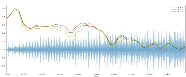
Spectral bandwidth:
Bandwidth is defined as the change or difference in two frequencies, like high and low frequencies.
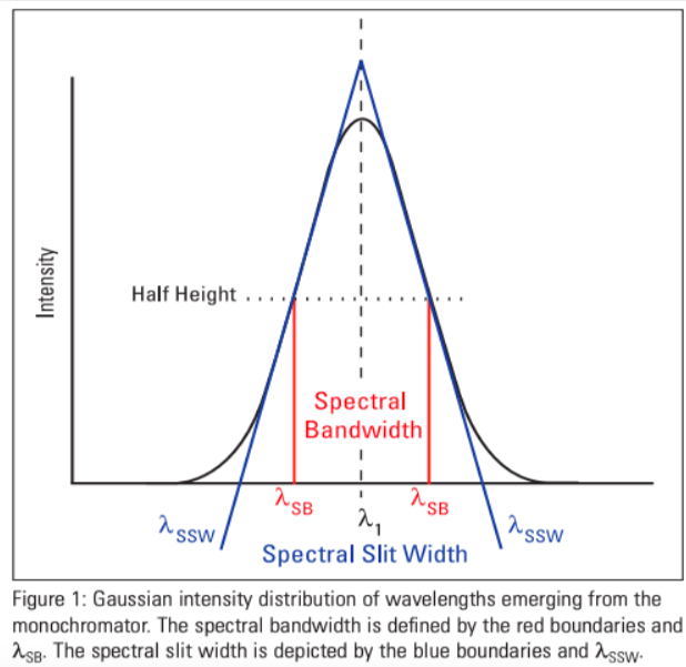
1
2
3
4
5
6
7
8
spectral_bandwidth_2 = librosa.feature.spectral_bandwidth(x + 0.01, sr = sr)[0]
spectral_bandwidth_3 = librosa.feature.spectral_bandwidth(x + 0.01, sr = sr, p = 3)[0]
spectral_bandwidth_4 = librosa.feature.spectral_bandwidth(x + 0.01, sr = sr, p = 4)[0]
plt.figure(figsize = (15, 9))
librosa.display.waveplot(x, sr = sr, alpha = 0.4)
plt.plot(t, normalize(spectral_bandwidth_2), color = 'r')
plt.plot(t, normalize(spectral_bandwidth_3), color = 'g')
plt.plot(t, normalize(spectral_bandwidth_4), color = 'y')
