September 13, 2021
Data Visualization with Streamlit - Part I

Without learning front-end programming, you can use Python to write beautiful, interactive web applications simply and efficiently. You can immediately show your data analysis results to your customers. Sounds great, right? With Streamlit this can be easily achieved.
Why Streamlit?
For developers, it only takes a few minutes to build and deploy powerful data applications.
You can easily build a web app without any basic front-end development skills. Within Streamlit, the web page will be updated with code changes on the fly, then you can observe the changes in real time, which is convenient for debugging. Streamlit also provides a caching scheme to avoid re-performing heavy operations like recalculating expensive functions, redrawing plots, etc. By leveraging the caching scheme, we can get great performance in the Streamlit app.
Streamlit also supports integration with other popular data processing and visualization libraries, for example, we can use plotly, matplotlib, pandas, or numpy along with Streamlit.
Due to the advantages above, Streamlit becomes one of the best frameworks to develop a data application.
This article will show you how to use Python to make a data visualization panel, using the Streamlit library.
Prerequisites
Choose one IDE or text editor (such as Visual Studio Code).
Install Python 3.6-3.8 (The version used in this article is Python 3.8.10).
Install PIP.
Set up a virtual environment
To ensure that the dependent packages introduced by Streamlit will not affect your other Python projects, no matter which package management tool you use, it is recommended to run the following commands in a virtual environment like conda, virtualenv, pipenv, etc.
Install streamlit
Use “pip” to install and run the “hello” application.
1 2pip install streamlit streamlit hello
In the next few seconds, the sample application will open in the default browser, indicating that the Streamlit module has been successfully installed on this machine.

Add text data
After you have installed Streamlit, you can create a Python script and import the Streamlit module. You can add some text data to it. There are many APIs in the Streamlit module to achieve the above purpose, and it supports the Markdown format.
1 2 3 4import streamlit as st st.title('This is my first app!') st.header('This is a header') st.markdown('Streamlit is **_really_ cool**.')
The output is:
Every time you modify the code, you can click “rerun” to execute the interface and display the latest results. More importantly, you can click “always rerun”, so that the results are automatically refreshed after each modification of the code.

Display data
In addition to adding text content to the page, the table content can also insert data into the page through the “st.write()” method.
1
2
3
4
5
6
7
8
9
import streamlit as st
import numpy as np
import pandas as pd
st.title('This is my first app!')
st.write('This is a table')
dataframe = pd.DataFrame(np.random.randn(10, 20),
  columns = ('col %d' % i
    for i in range(20)))
st.write(dataframe)
The output is:
Actually, we don’t need to call any Streamlit method to display the data. Streamlit supports "magic commands’’. You can write markdown text and table data into the application with a small amount of keyboard operations. For example, in the above, we can also directly use “dataframe” instead of “st.write(dataframe)”, the result is the same.
1
2
3
4
5
6
7
8
import streamlit as st
import pandas as pd
import numpy as np

dataframe = pd.DataFrame(np.random.randn(10, 20),
  columns = ('col %d' % i
    for i in range(20)))
dataframe
Visualization of the chart
1) You can use line_chart in Streamlit to display a line chart.
The data of the above chart can be displayed as a chart, as follows:
1
2
3
4
5
6
dataframe = pd.DataFrame(np.random.randn(10, 5),
  columns = ('col %d' % i
    for i in range(5)))
dataframe
st.write('This is a line_chart.')
st.line_chart(dataframe)
The output is:
2) Visualization of area chart
The “area_chart” method in Streamlit can display area charts.
1 2st.write('This is a area_chart.') st.area_chart(dataframe)

3) Visualization of histogram
The “bar_chart()” method of Streamlit can display histograms.
1 2st.write('This is a bar_chart.') st.bar_chart(dataframe)

4) Map visualization
Use the “st.map()” method to display data points on the map. Let’s first generate some random sample data and visualize it on the map of Salinas.
1
2
3
4
5
st.write('Map data')
data_of_map = pd.DataFrame(
  np.random.randn(1000, 2) / [60, 60] + [36.66, -121.6],
  columns = ['latitude', 'longitude'])
st.map(data_of_map)
The output is:
Display pictures
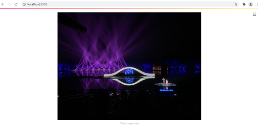
The “image” method in Streamlit can be used to display one or more images.
1 2image = Image.open('picture.jpg') st.image(image, caption = 'This is a picture', use_column_width = True)
The output is:
It’s also easy to display audio with “streamlit.audio” or video with “streamlit.video” method.
In the next article, we will introduce the widgets of Streamlit and make a visual dashboard about COVID-19 with the Streamlit framework.